
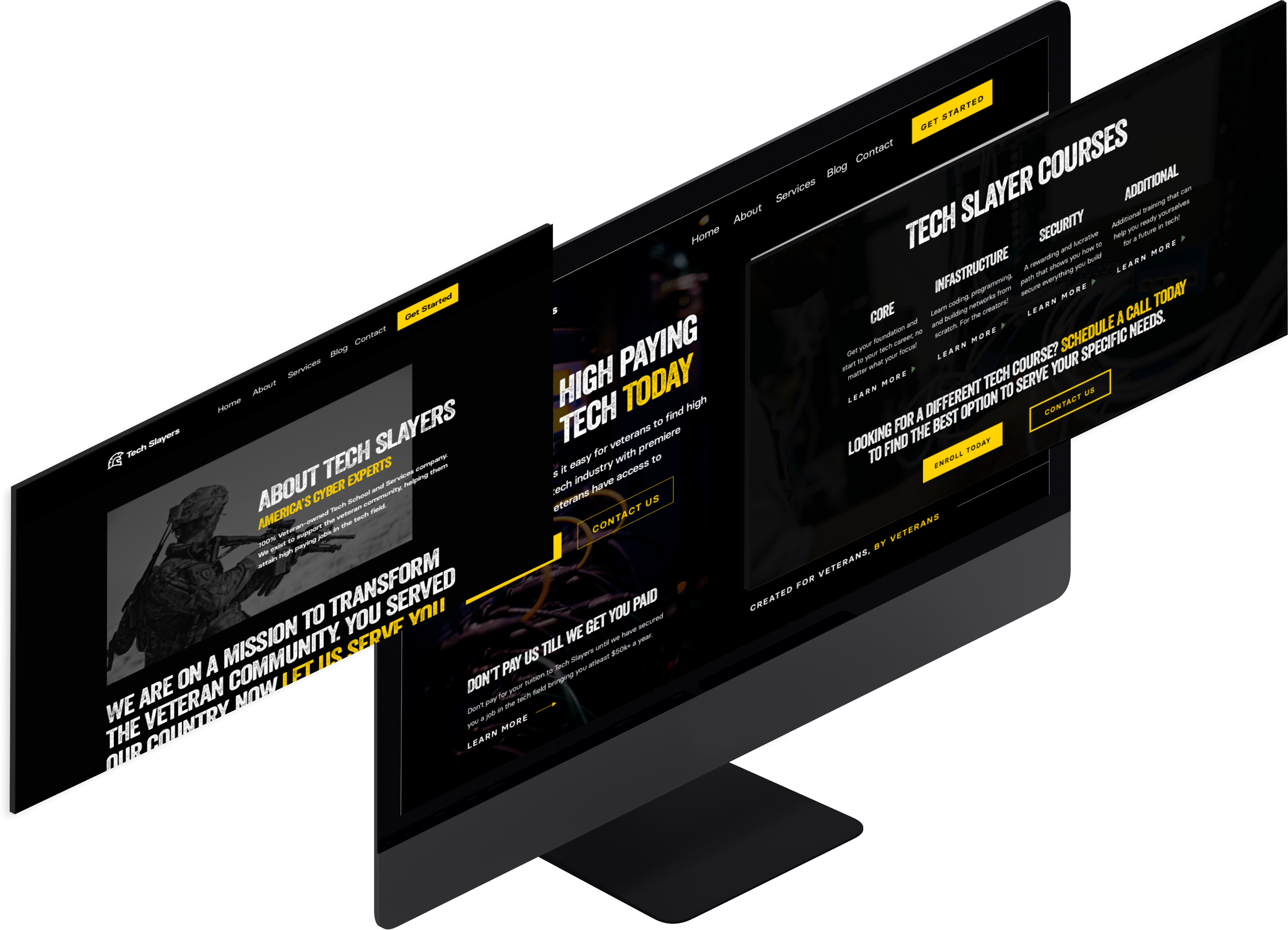
Brandon Shake, the CEO of Tech Slayers, had a vision to create a training bootcamp that helps veterans secure high-paying jobs in the tech industry. He’d seen competitors who make the process confusing and overwhelming, and wished to create a solution for them that was familiar, easy, and seamless. As a veteran himself, he valued the service veterans provided for our country, and wanted to serve them by helping transform their lives with a stable & high-paying career.
We created a veteran-styled brand identity by referencing other companies with a more ‘rugged’ feel, as well as using the yellow color from the US Army’s website itself to create familiarity. We then used this branding to build out an optimized website that removes all the tech jargon other competitors bombard their customers with, making the process easy to understand and visualize for the average veteran.
The team at Tech Slayers approached us with the vision to create a training bootcamp that completely changes the IT training industry on it’s head. As a past veteran himself, the CEO Brandon Shake knew how veterans think, and wanted to create a solution that helps.
Many veterans have trouble adjusting back to civilian life, which is where Brandon wanted to make a difference. By creating a training bootcamp that makes IT training accessible to veterans, his mission was to provide as many veterans as possible with the education and certifications necessary to get employed in the growing cyber-security industry.
With a vision and a dream, Brandon approached us to redesign their current logo to feel more tech-oriented, while keeping it ‘rugged’ enough to appeal to veterans. He also wanted us to create a website for the startup from the ground-up that made the training bootcamp appeal to veterans, while also making entry into the tech-industry seem easy, as it should be.
He had seen many of his competitors websites, and most had confusing navigation, with an overload of information that just wasn’t necessary to the end user.
Upon starting the Tech Slayers project, we first had an interview type call with Brandon and his partner Ben, where we wanted to get the feel of what a ‘veteran’ would look for.
They gave us references like Black Rifle Coffee, where they loved the overall aesthetic and felt that it really captured the feeling veterans like when viewing a brand.
They also showed us a few of their competitors websites, and showed us what they didn’t like about them. Confusing navigation, bland design, and an overwhelming amount of information.
Their goal was to keep it simple, clean, and informative, and we helped them achieve that vision.
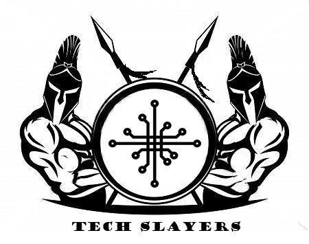
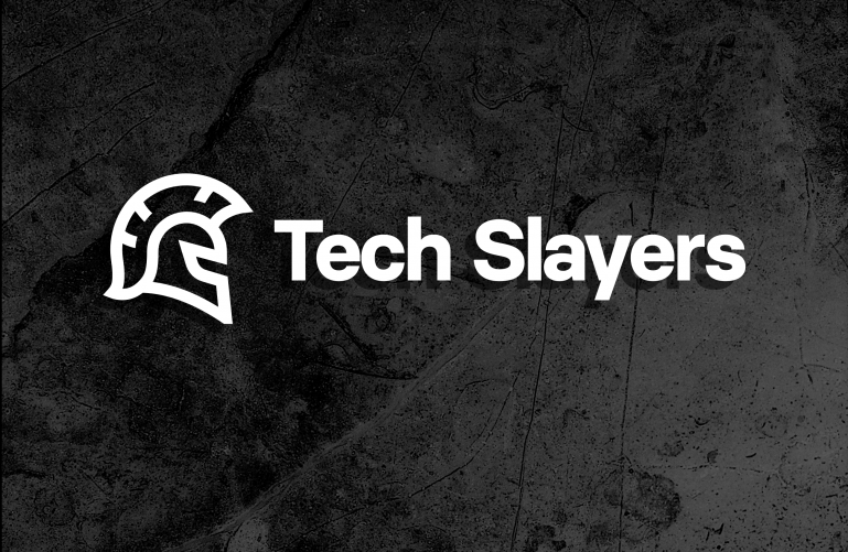
Our first task was to redesign their logo.
They had a vision of keeping a ‘spartan’ type theme to the logo, to give the veterans a feeling of familiarity and ‘ruggedness’ – while having a logo that was professionally done.
We tackled this problem head on.

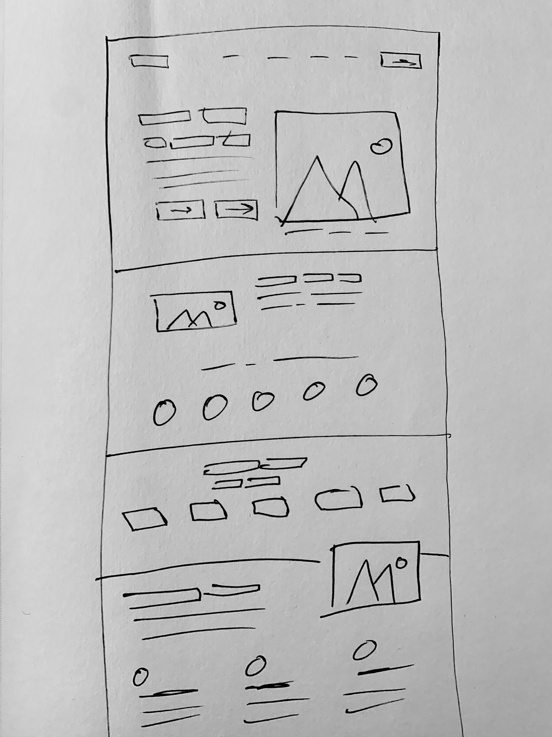
We began by first drawing out a very rough sketch of our vision of the home page.
By keeping it extremely high-level, we were able to build out the initial structure of the page, and would allow our creative vision to fill in the pieces later on in the mockup part of our design process.
Using the screen design software Sketch, we built out a full-fledged mockup of what our vision for Tech Slayer’s website would look like.
We focused on keeping the user experience clean and informative.
The challenge lied in theming the website to be both veteran-themed while also encompassing a feeling of ‘tech’.
After finishing our mockup from our vision, we got approval from both Brandon and Ben immediately.
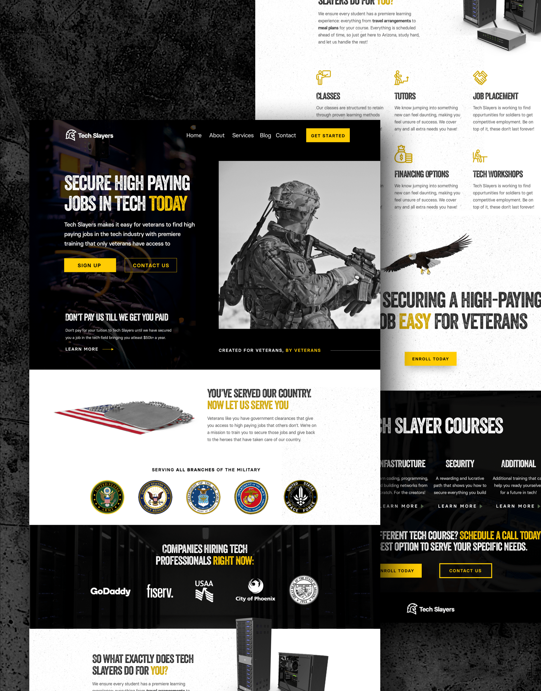
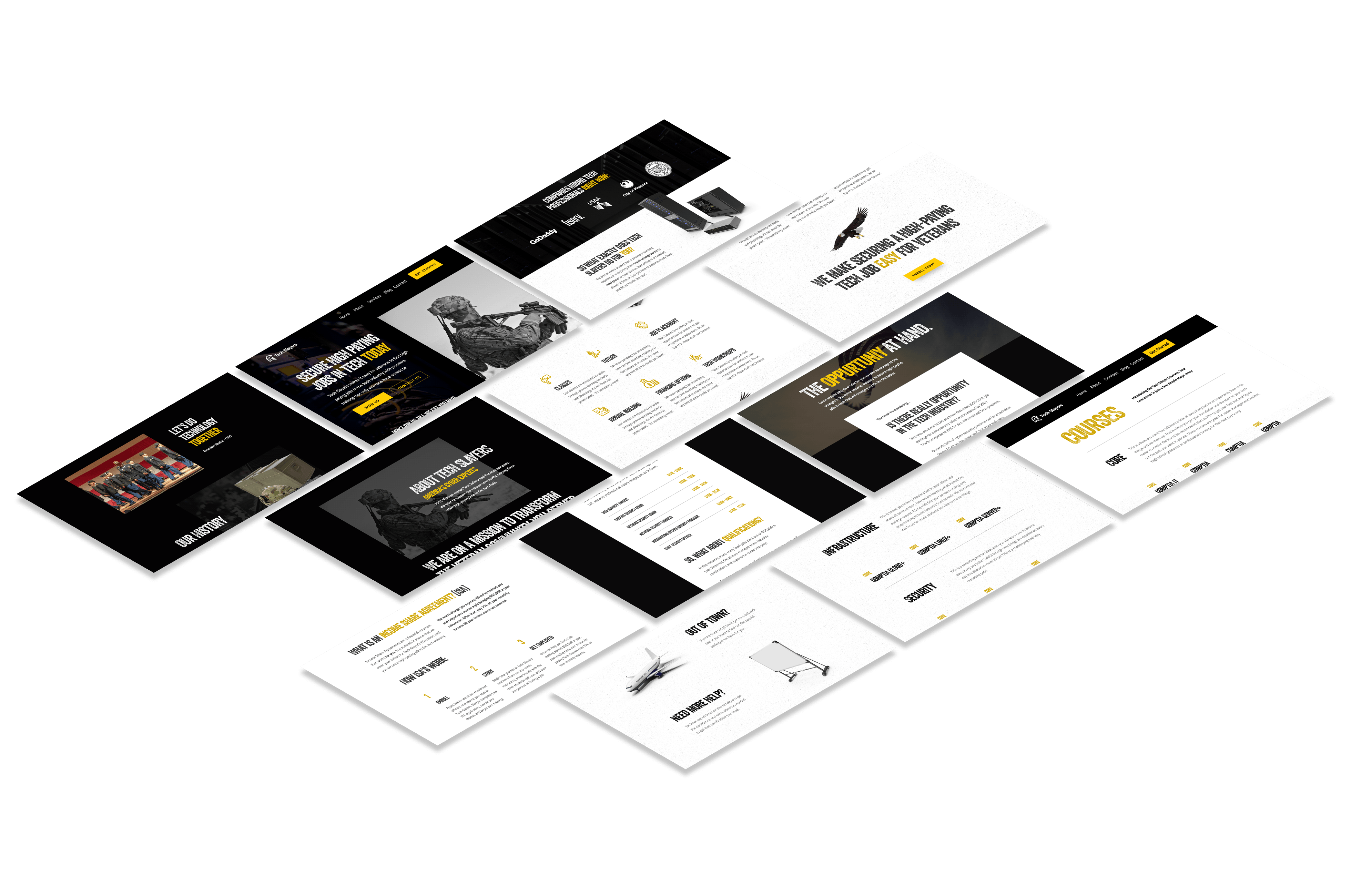
We built out the Tech Slayers website on WordPress. Development phase panned out to 4 days, where we built out the Home Page, About Us, Income Share Agreements Page, Courses Catalog Page, and Get Started / Contact Us Page.

Click the link below to apply now to work with Bank Account Builders.

